
Have you ever ordered custom curtains online, only to discover that the beautiful shade you selected on your screen looks completely different when it arrives at your door? You're not alone. Color discrepancies between digital displays and physical fabrics are one of the most common concerns in the custom curtain industry, affecting up to 70% of online purchases.
Understanding why these differences occur – and how to minimize them – can save you time, money, and disappointment while ensuring you get the perfect curtains for your space.

The Science Behind Screen-to-Fabric Color Variations
Color perception is a complex interaction between light, material properties, and human vision. When you view a curtain color on your screen versus seeing the actual fabric, you're experiencing two completely different optical phenomena.

Digital Color vs. Physical Color
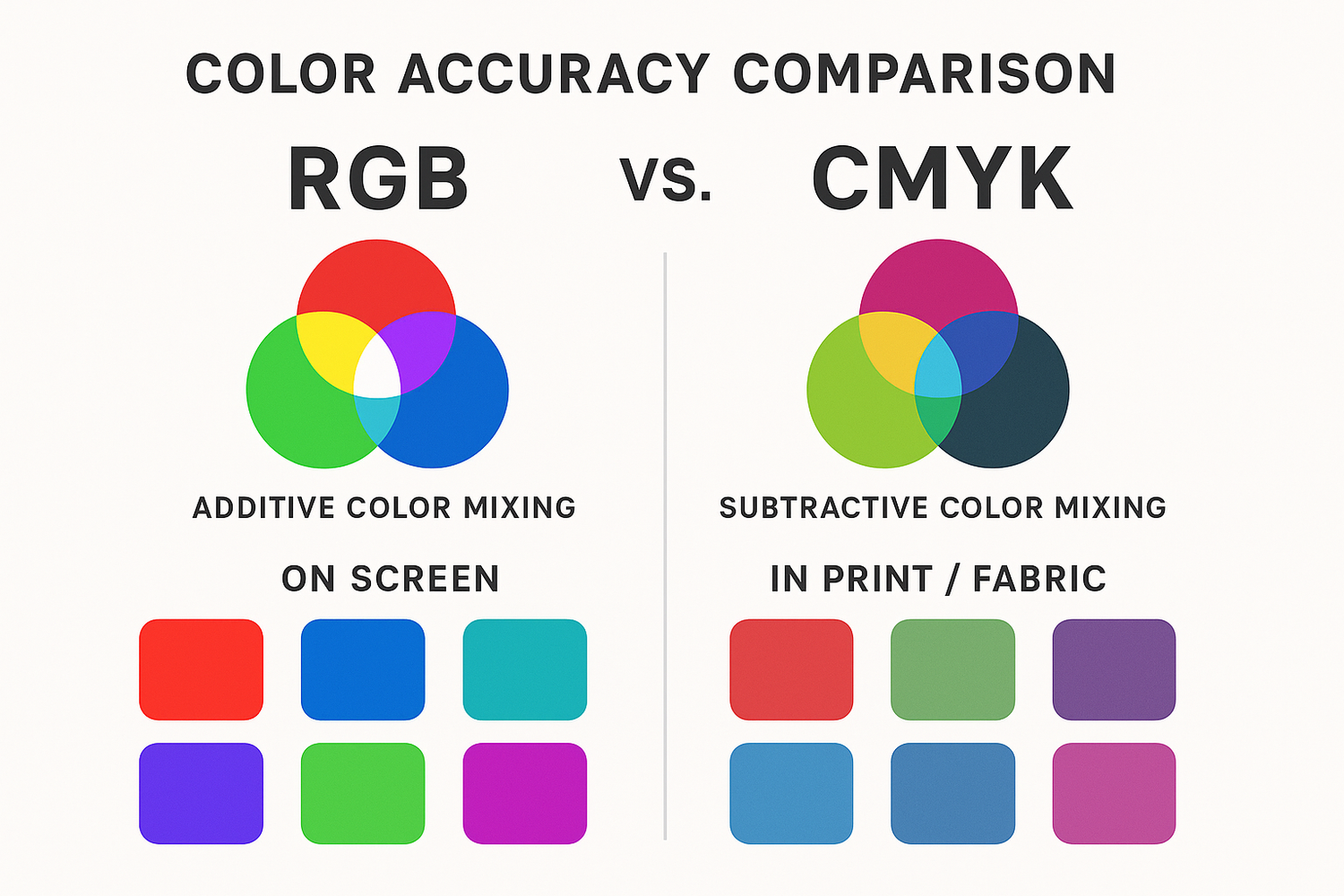
Your computer screen uses additive color mixing (RGB - Red, Green, Blue light) to create colors, while fabric uses subtractive color mixing (absorbing and reflecting specific wavelengths of light). This fundamental difference means that some colors simply cannot be accurately reproduced on screens.

Key Factors Affecting Color Perception:
- Light source: Screen backlighting vs. ambient room lighting
- Material properties: Fabric texture, weave, and fiber composition
- Viewing angle: Screen viewing angle vs. fabric drape and fold
- Color gamut limitations: Screen's ability to display color range
Screen Technology and Color Accuracy
Not all screens are created equal when it comes to color reproduction. Understanding your display's limitations helps set realistic expectations for color matching.
Display Technology Comparison:
| Screen Type | Color Accuracy | Color Gamut | Typical Use | Reliability for Fabric Selection |
|---|---|---|---|---|
| Standard LCD | Fair | sRGB (limited) | Basic computing | Low |
| IPS LCD | Good | sRGB to Adobe RGB | Professional work | Moderate |
| OLED | Excellent | Wide color gamut | Premium devices | High |
| Professional Monitor | Exceptional | Adobe RGB+ | Color-critical work | Very High |

Manufacturing Variables That Affect Final Color
Even when screen colors are perfectly calibrated, manufacturing processes introduce variables that can alter the final fabric color from what was originally photographed or digitally represented.
Dye Lot Variations
Fabric dyeing is done in batches called 'dye lots.' Each batch can have slight color variations due to:
- Temperature fluctuations: Even 2-3°C differences affect dye absorption
- Chemical composition: Water quality and chemical purity variations
- Timing variations: Dye bath duration and processing speed
- Equipment differences: Different machines may produce slightly different results
Acceptable Industry Standards:
| Color Category | Acceptable Variation (ΔE) | Visual Perception | Industry Standard |
|---|---|---|---|
| Critical Colors | 0-1 ΔE | Imperceptible difference | Luxury/Premium |
| Standard Colors | 1-3 ΔE | Slight, acceptable difference | Commercial Standard |
| Acceptable Range | 3-6 ΔE | Noticeable but acceptable | Budget/Economy |
| Unacceptable | 6+ ΔE | Clearly different color | Quality failure |

Fabric Composition and Color Interaction
Different fiber types absorb and reflect light differently, significantly affecting how colors appear in the final product compared to digital representations.
Fiber Type Impact on Color:
Natural Fibers:
- Cotton: Absorbs dyes well but can appear muted compared to screen colors
- Linen: Natural texture creates color depth variations not visible on screen
- Silk: High sheen creates color shifts depending on viewing angle
- Wool: Fiber structure can make colors appear softer than digital versions
Synthetic Fibers:
- Polyester: Consistent color reproduction but can appear more vibrant than natural fibers
- Nylon: Excellent color retention but may show differently under various lighting
- Acrylic: Good color fastness but texture affects light reflection
Weave Pattern Effects:
| Weave Type | Light Interaction | Color Appearance | Screen Accuracy |
|---|---|---|---|
| Plain Weave | Even light reflection | True to dye color | High accuracy possible |
| Twill Weave | Directional light play | Color shifts with angle | Moderate accuracy |
| Satin Weave | High sheen, reflective | Dramatic color changes | Low accuracy |
| Jacquard | Complex texture effects | Multi-tonal appearance | Very low accuracy |
Environmental Factors Affecting Color Perception
The environment where you view colors – both on screen and in person – dramatically affects color perception and can explain many discrepancies between expectation and reality.
Lighting Conditions Impact:
Screen Viewing Environment:
- Ambient lighting: Room lighting affects screen color perception
- Screen brightness: Brightness settings alter color appearance
- Viewing time: Eye adaptation changes color sensitivity
- Surrounding colors: Adjacent colors influence perception
Fabric Viewing Environment:
- Natural vs. artificial light: Different light sources reveal different color aspects
- Time of day: Morning, noon, and evening light have different color temperatures
- Room colors: Wall and furniture colors affect fabric color perception
- Light direction: Front-lit vs. back-lit fabric appears different
Color Temperature Effects:
| Light Source | Color Temperature (K) | Effect on Warm Colors | Effect on Cool Colors |
|---|---|---|---|
| Candlelight | 1900K | Enhanced, richer | Muted, grayed |
| Incandescent | 2700K | Warmer appearance | Less vibrant |
| Fluorescent | 4000K | Cooler appearance | More vibrant |
| Daylight | 5500K | True color | True color |
| Blue Sky | 10000K | Muted, cooler | Enhanced, brighter |

Photography and Digital Representation Challenges
The process of photographing fabric for online display introduces multiple variables that can alter color accuracy, even before screen technology limitations come into play.
Photography Variables:
- Camera sensor limitations: Different sensors capture colors differently
- White balance settings: Incorrect settings shift all colors
- Lighting setup: Studio lighting may not match home lighting
- Post-processing: Digital editing can alter original colors
Digital File Compression:
Image compression for web use can reduce color accuracy:
- JPEG compression: Lossy compression affects color gradients
- Color space conversion: Converting between color spaces loses information
- File size optimization: Smaller files mean less color data

How to Minimize Color Discrepancies
While perfect color matching between screen and fabric is impossible, several strategies can significantly reduce discrepancies and improve satisfaction with your custom curtain purchase.
Pre-Purchase Strategies:
1. Request Physical Samples
Always request fabric samples before placing large orders:
- View samples in your actual room lighting
- Check colors at different times of day
- Compare samples against existing decor
- Test samples against your specific lighting fixtures
2. Understand Your Screen Limitations
| Screen Calibration Check | Method | Reliability Indicator |
|---|---|---|
| Color temperature | Compare white areas to white paper | Should appear neutral white |
| Brightness levels | View in different ambient lighting | Consistent appearance |
| Color accuracy | Compare known colors to real objects | Close color matching |
3. Consider Professional Color Consultation
For critical color matching projects, professional consultation can prevent costly mistakes:
- In-home color assessment
- Professional lighting analysis
- Color coordination with existing elements
- Fabric selection guidance
Working with Color Variations
Sometimes slight color variations can actually enhance your interior design when properly managed and understood.
Embracing Natural Variation:
- Texture interest: Slight color variations add visual depth
- Natural authenticity: Perfect uniformity can appear artificial
- Lighting adaptability: Varied tones work better in changing light
- Design flexibility: Subtle variations complement more decor styles
When to Accept vs. Return:
| Situation | Recommended Action | Reasoning |
|---|---|---|
| Slight warmth/coolness shift | Accept and adapt | Often improves with room integration |
| Completely different color family | Return/exchange | Indicates quality or process failure |
| Darker/lighter than expected | Evaluate in room context | May work better than anticipated |
| Pattern colors don't match | Return/exchange | Affects overall design integrity |
Quality Assurance and Return Policies
Understanding your rights and the manufacturer's quality standards helps ensure satisfaction with your custom curtain purchase.
Industry Standard Return Policies:
- Color variation tolerance: Most manufacturers accept 3-6 ΔE variation
- Sample matching: Final product should match approved samples
- Dye lot consistency: All panels should be from the same dye lot
- Return timeframe: Typically 30-60 days for color issues
Documentation for Returns:
If color discrepancy is significant, document the issue:
- Photograph fabric in natural daylight
- Compare to original sample if available
- Note specific color differences observed
- Document lighting conditions during evaluation
Future Technology and Color Matching
Emerging technologies are improving color accuracy between digital displays and physical fabrics, offering hope for better color matching in the future.
Advancing Technologies:
- Spectral imaging: Captures more color information than traditional photography
- AR visualization: Allows virtual placement of fabrics in actual rooms
- Improved displays: Wider color gamut screens show more accurate colors
- AI color matching: Machine learning improves color prediction accuracy
Professional Tips for Color Success
Interior designers and color professionals use specific strategies to achieve successful color outcomes when working with custom fabrics.
Designer Strategies:
- Always work with samples: Never rely solely on screen colors
- Consider the room's color story: How the fabric fits the overall palette
- Plan for lighting changes: Consider how colors work in different lighting
- Build in flexibility: Choose colors that work with slight variations
Color Selection Best Practices:
| Color Type | Screen Accuracy | Recommendation | Risk Level |
|---|---|---|---|
| Neutral colors | High | Safe for online selection | Low |
| Earth tones | Moderate | Request samples | Moderate |
| Bright colors | Low | Always sample first | High |
| Complex patterns | Very low | Professional consultation | Very high |
Conclusion: Setting Realistic Expectations
Understanding why custom curtains might appear different from their screen representation is the first step toward successful color selection. While perfect color matching between digital displays and physical fabrics remains challenging, informed buyers can minimize discrepancies and make better decisions.
The key to success lies in:
- Understanding the limitations of screen technology
- Recognizing manufacturing variables
- Always requesting physical samples for important projects
- Working with reputable suppliers who understand color challenges
- Setting realistic expectations about color variation
Remember that slight color variations are normal and often enhance the natural beauty of fabric. The goal isn't perfect color matching – it's achieving a result that works beautifully in your space and meets your functional needs.
Ready to Order Your Custom Curtains?
Browse our extensive fabric collection with confidence, knowing that we provide detailed color information, professional samples, and expert guidance to help you achieve the perfect color match for your space. Our color specialists are available to help you navigate the selection process and ensure your satisfaction with the final result.
Don't let color uncertainty hold you back from creating the perfect window treatments for your home.


Leave a comment
This site is protected by hCaptcha and the hCaptcha Privacy Policy and Terms of Service apply.